
El Chupacabra Ecommerce Addition
Overview
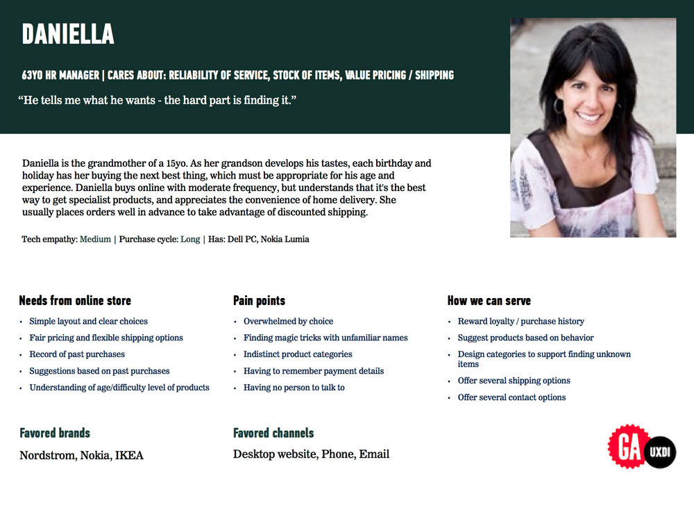
For this concept project I was asked to redesign or add an ecommerce feature to a site. We had the choice of 3 pre generated personas, I chose Daniela to be my primary persona. Because she seemed the most relatable to me. for my storyboard I pretended she was a friend of mine and we chatted about the restaurant in passing.
StoryBoard/Scenario
Daniella is a friend of mine, she is a 63 year old grandmother that lives on Phinney ridge, she buys online with moderate frequency, and she usually places orders well in advance. I bumped into Daniella a few weeks ago at the grocery store, she asked me what I was up to? I said ”well I’m headed to Chupacabra for dinner.” She shakes her head at me and says “ I would totally eat there more but, you know what I hate about that place?” “They Don't have online ordering, worse, they don't have prices!” “Yeah” I say. “Unless you wanna download their PDF menu!?” “Pfft, I could go on for hours about that site.” She tells me “Maybe someone should just fix it.” ”Anyway I gotta go pickup my grandson, see you around Josh.” So I head into Chupacabra and I see Dave working behind the bar. I’m like ”DAVE, dude your website sucks!” he’s like “ totally, but what am I gonna do about it? So I tell Dave that I am a Jr. UX Designer in the making and that I work with a team of geniuses, we can fix this. He's like “you’re a what!?” So after dinner I immediately go home and call Daniella. I ask her about her pain points and must haves in a website, what could we do to make her shop there more? She tells me she wants a simple layout and clear choices. She hates being overwhelmed by choice and indistinct product categories.

About
El Chupacabra is a Mexican restaurant with 3 locations in the greater Seattle area. They specialize in cheap delicious mission style burritos and have a great selection of cocktails for adults, and a well rounded menu for the entire family.
My role
My role in this project was interaction design, with light research and usability testing.
Problems
El Chupacabras website lacks online ordering, prices and clear contact information.
Solution
My goal was to update the site to allow online ordering, on site menu and clear contacts.
The first step
Create a competitive analysis of 5 restaurants within walking distance of El Chupacabra. I then wrote down 8 interview questions based off the topic map I made from the persona I chose.


Second step
From there I took the data from the interviews and created a affinity diagram to close in on the common trends.
Third step
I built a site map and began sketching, card sorting, wire framing and building user flows for the tasks I wanted to test in Invision.


Early Sketches

Paper Prototype


Invision Prototype


Final Wireframes
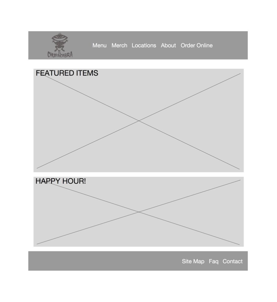
Home Screen

Detailed Menu Screen

Item Detail Page

Menu Screen

MenuScreen w/Cart

Checkout Page
Iterations
First major iteration was to change the menu cart page.
Removed the background image.
Made the menu categories bigger.
Cleaned up the order summary window.
Why?
Testers were confused by images stacked on top of other images.
Category buttons are small and text covers images.

1

1a
Iterations
Second major iteration was to change the menu item screen.
Completely remove the pop up windows from the design.
Remove the background image.
Why?
Testers found stacking windows to be confusing and unnecessary.
Images on top of other images is distracting.
Backing out of windows is unclear.


Iterations
Third major iteration was to clean up the checkout page.
Remove the background image.
Change location selection from pop up to drop down menu.
Moved the form to left side of screen based on user feedback.
Why?
The majority of the testers did not like the form on the right.
The location pop up was distracting and unnecessary.


Next Steps
A reward program(Spend $100 get $10 off your next purchase).
A review system, maybe a 5 star rating on items.
Also I would like to have the user be able to edit/customize multiple items at once from their cart.
Self Critique
This project was very eye opening, I would definitely focus a little more on research. Articulating my data would complement the process of wireframing and explain why I did the things I did to them. All around I need to sell the design with solid fact and proof backing up the prototype.
Research, iterate, research, iterate…..